292 Karangahape Road: A gallery café which shares our address in Leipzig

In Leipzig, Germany, the contemporary gallery and museum for art post-1945, Galerie für Zeitgenössische Kunst (GfZK), focuses on the reciprocal relationships between art, architecture, design, and international exchange. At regular intervals, GfZK commissions artists to redesign the on-site gallery café.
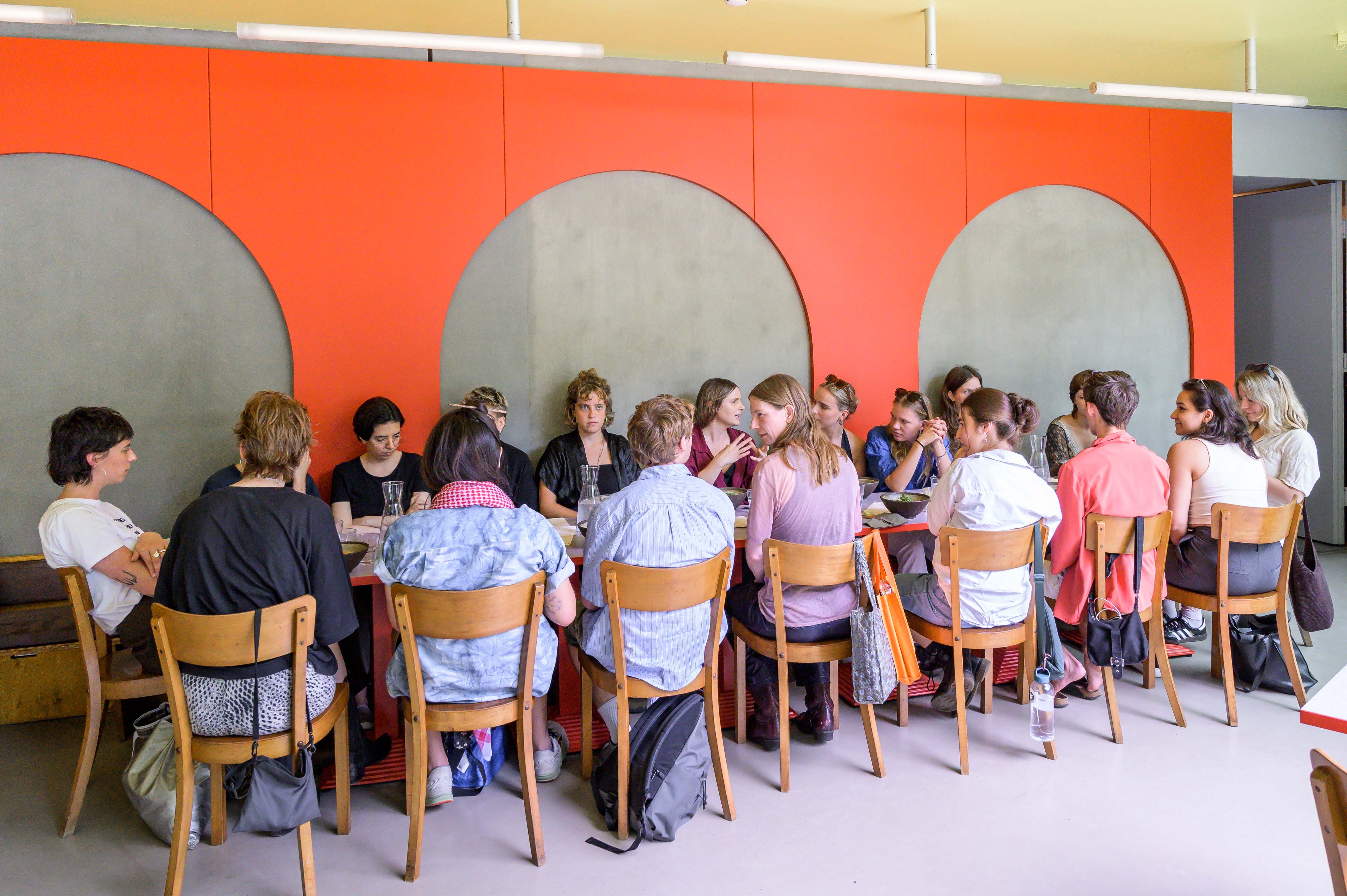
Artspace Aotearoa Kaitohu Director Ruth Buchanan redesigned the GfZK café this year in response to our annual question, "do I need territory?" Declaring it an outpost for Artspace Aotearoa from 2024–2029, Ruth named the cafe after the gallery's address, 292 Karangahape Road. Ruth has transferred the visual details of structure, colour, and graphic design from Artspace Aotearoa to the GfZK café. The opportunity to establish an international outpost allows further exploration of our annual question and for Ruth to play with authorship as an artist and leader of an artist-led organisation. She invites visitors to participate in a speculative exchange between Tāmaki Makaurau Auckland and Leipzig over the next six years.
Ruth launched this exchange in person during her visit to GfZK at the end of June, engaging with Leipzig audiences through public conversation and a workshop co-led with graphic designer and collaborator Lina Grumm of HIT Berlin. These engagements saw participation from students and practitioners from a diverse range of disciplines, including architecture, activism, graphic and information design, and visual arts.
In a letter to GfZK, Ruth establishes the context of Artspace Aotearoa in the 1973 purpose-built Auckland NZ Post Office. She notes the striking similarities between the roles of a post office and a contemporary art gallery. Both operate to communicate messages: "Love letters, bills, certificates; the film, the poster, the sculpture all capture the fullness of life."
What is the message sent from our address to your address? Our message is formed through colour, shape, and textuality, as we do at Artspace Aotearoa:
"The large type font, accessible to many different readers, is organised to differentiate which language is for what; the bright red used by the gallery is a nod to the colours used by NZ Post when they occupied the building; the arches are there because it just feels so good to be around that shape...."
Read Ruth's letter in full and see images on the GfZK website.